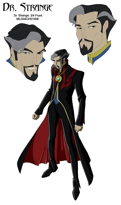
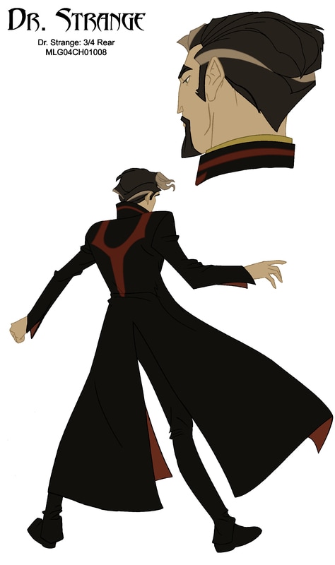
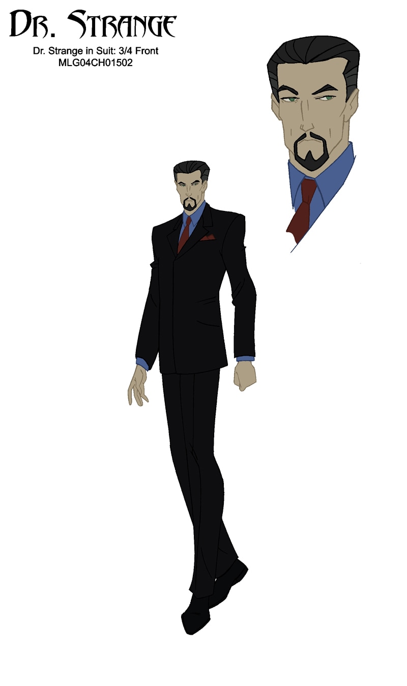
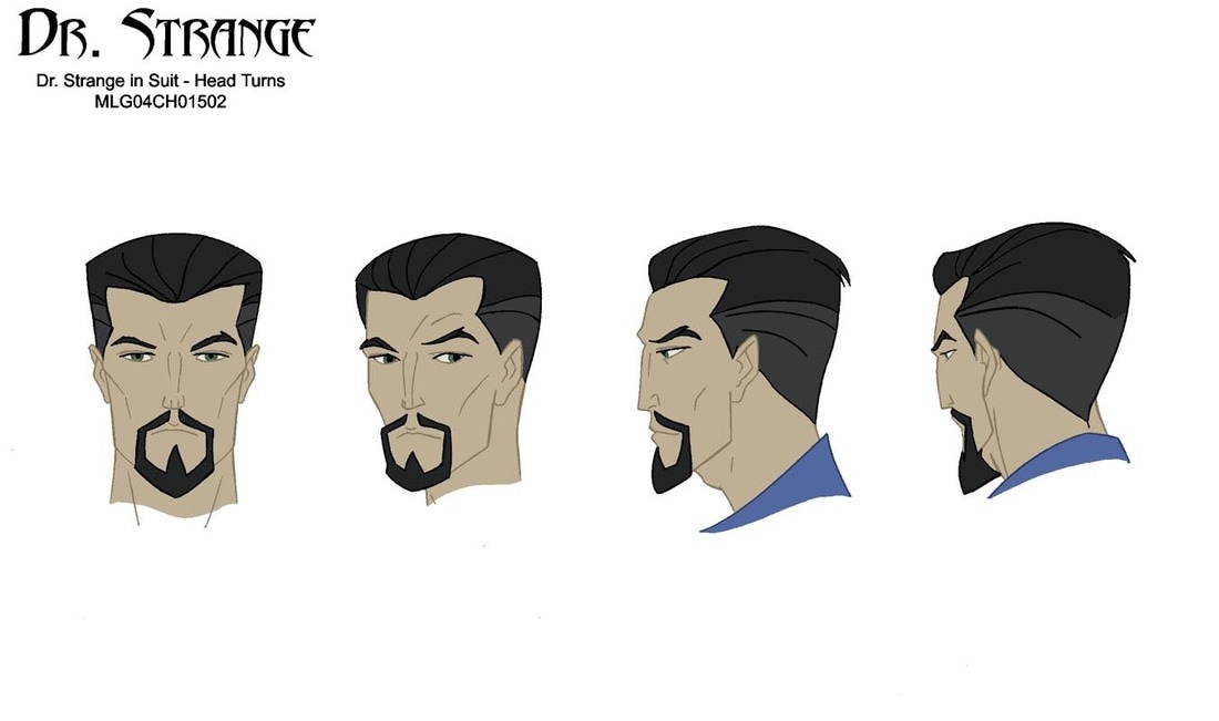
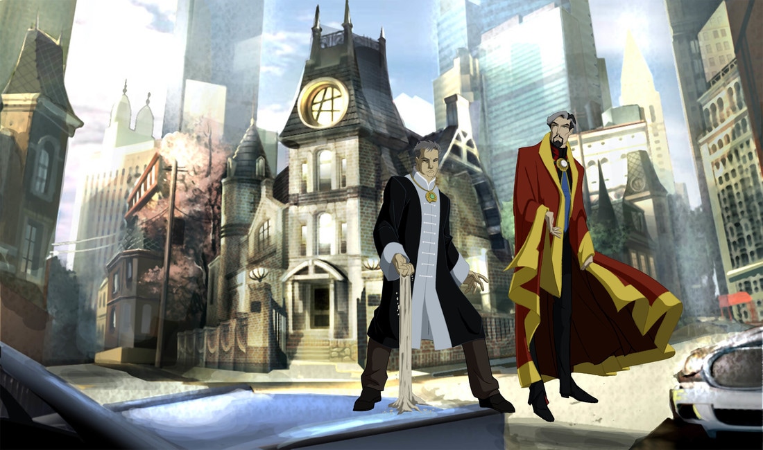
"DOCTOR STEPHEN STRANGE"
|
|

|

|

|

|

|


|

|

|

|


|
|

|

|
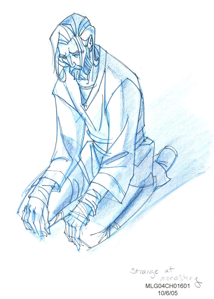
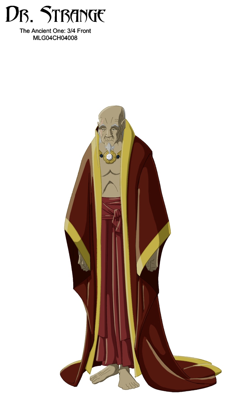
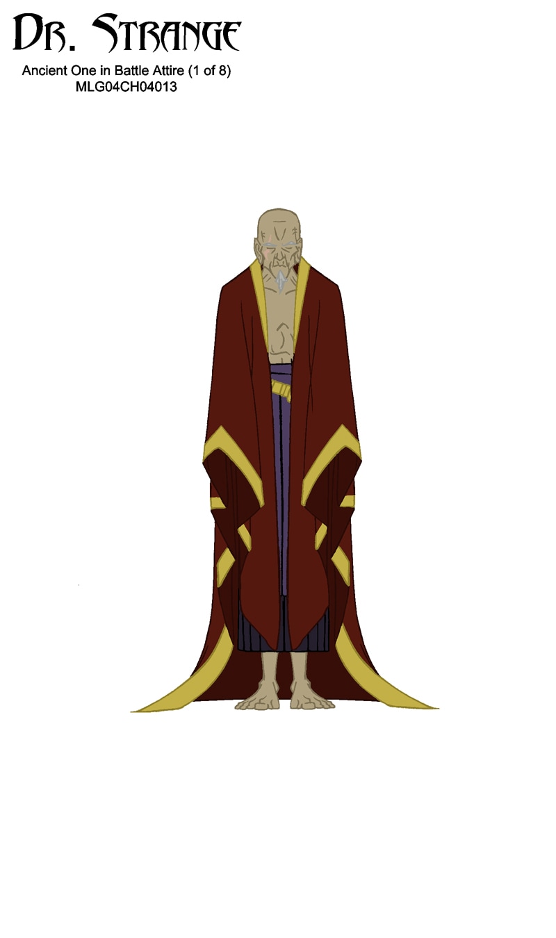
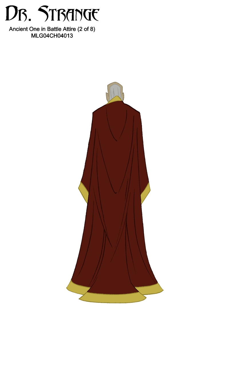
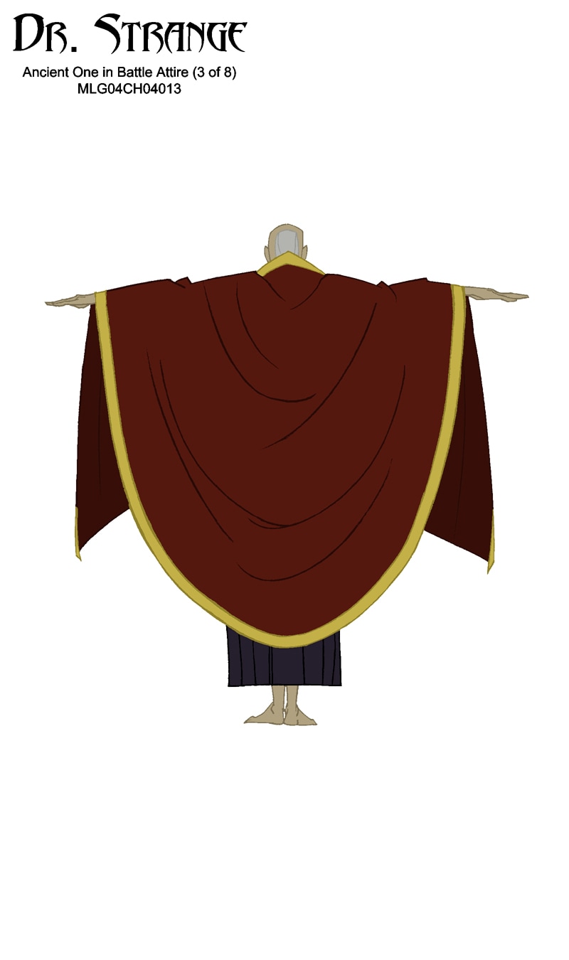
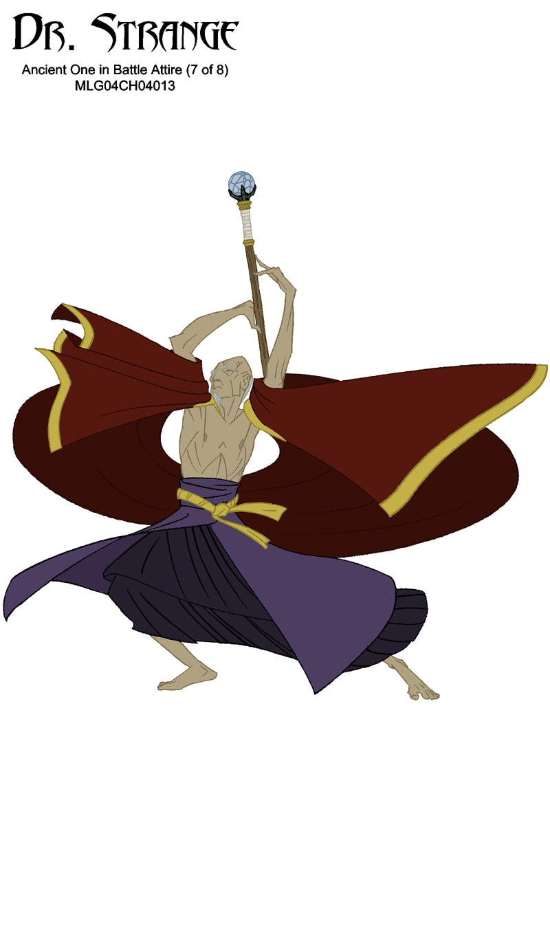
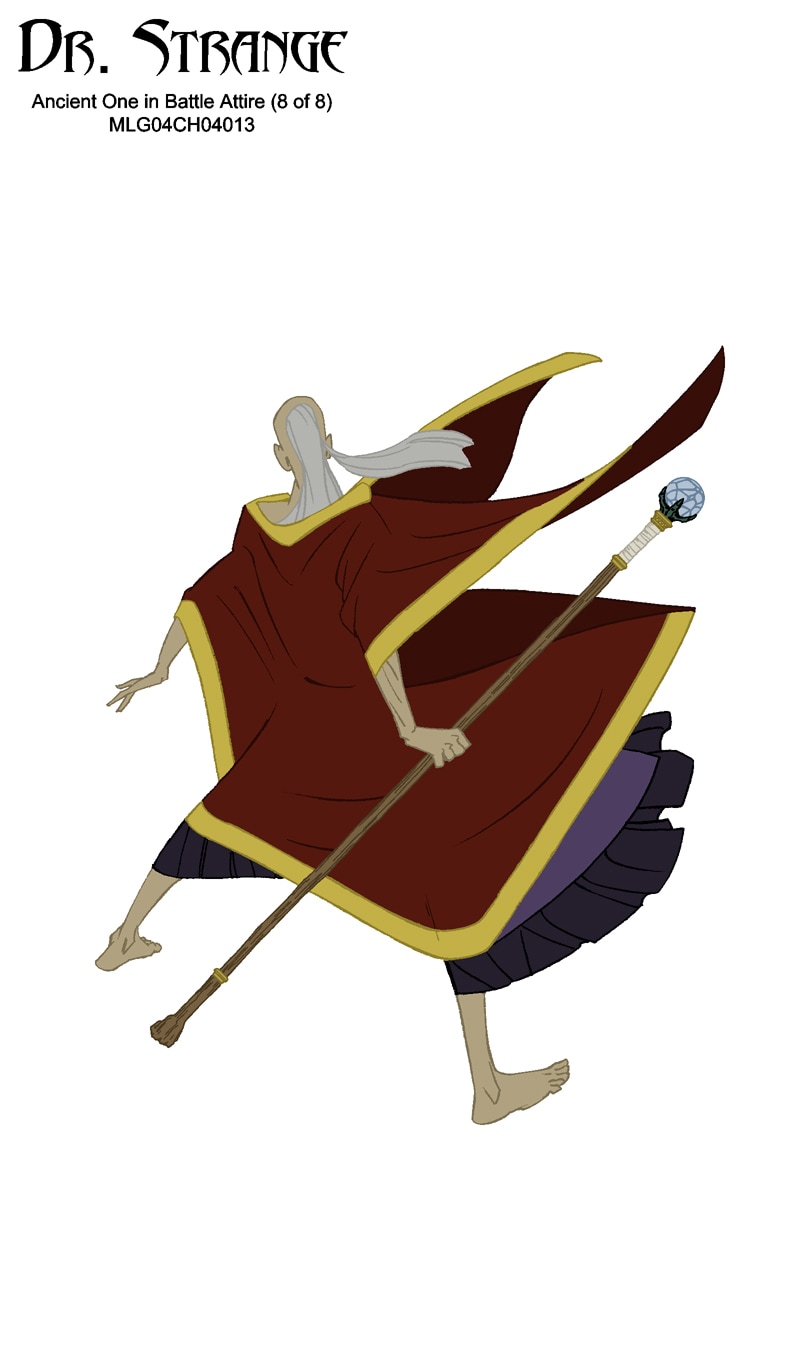
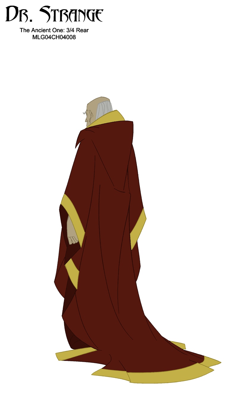
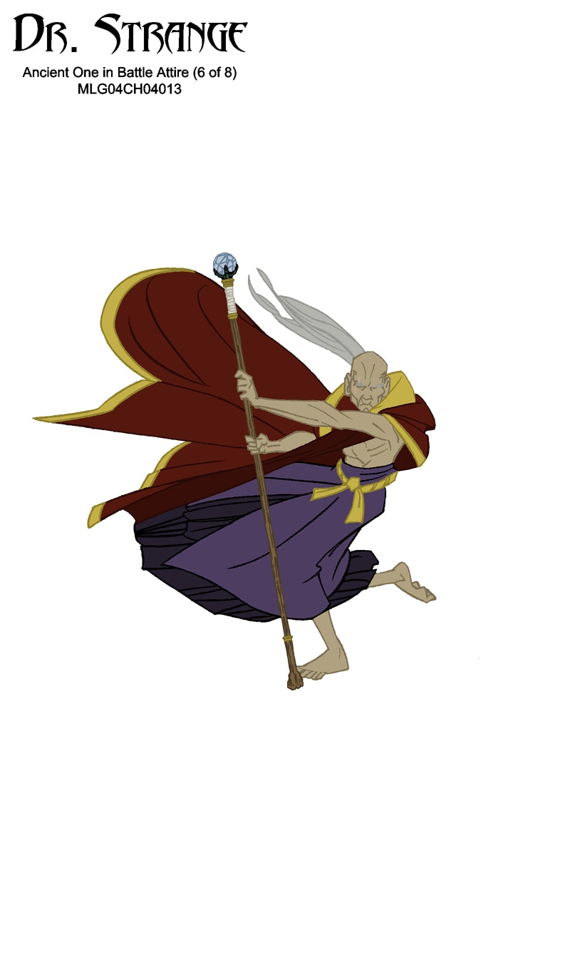
"THE ANCIENT ONE"

|
|
|
|


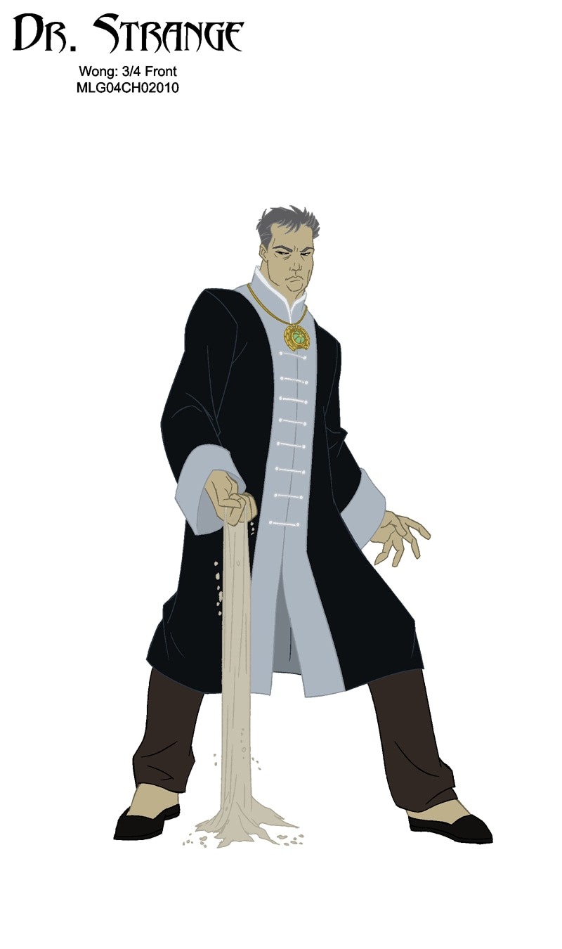
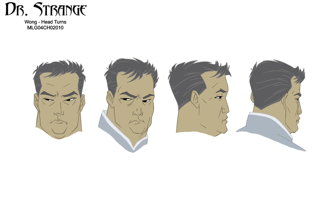
"WONG"
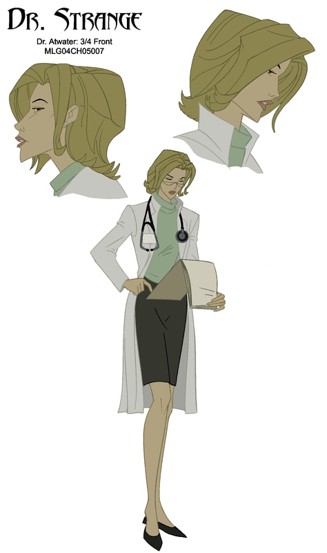
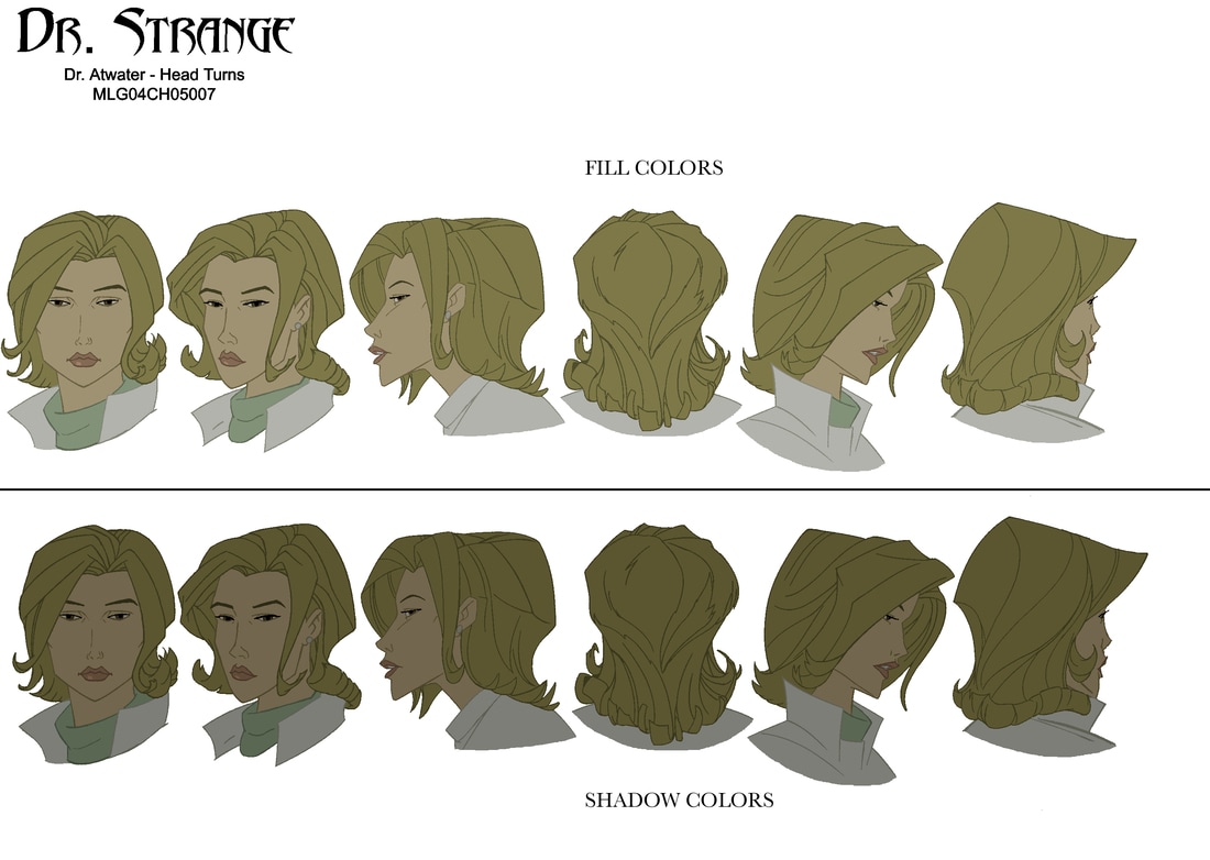
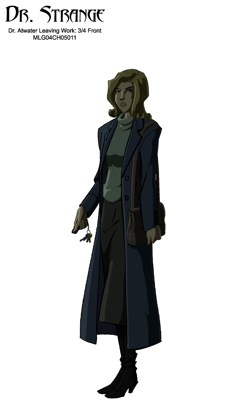
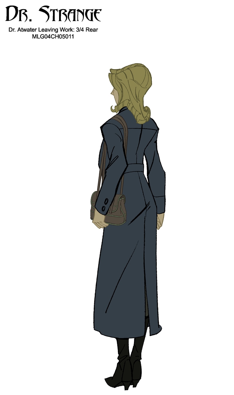
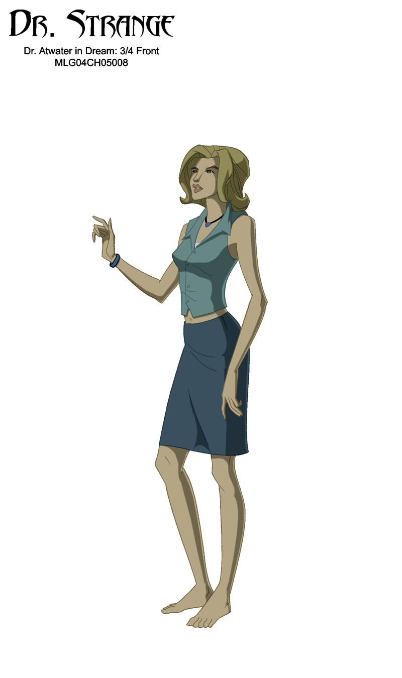
DR. ATWATER
"MERCY" |

|
|

"DORMAMMU"


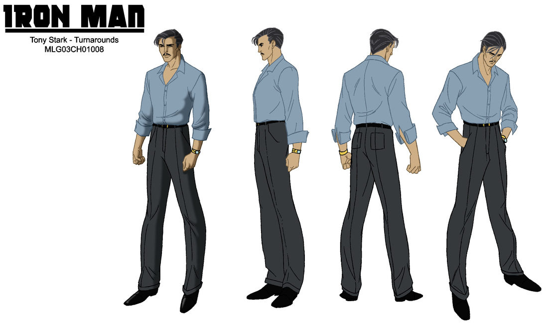
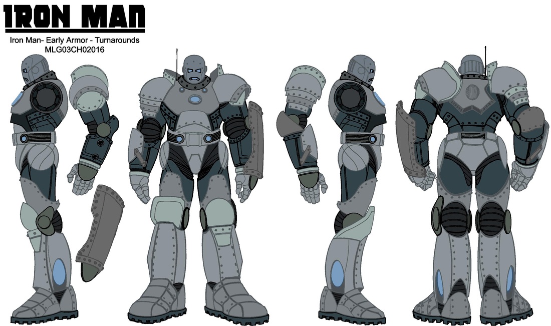
"The invincible iron man"


|
|

|

|

Li Mei throughout the course of the movie undergoes many costume changes, from cosmopolitan to traditional Chinese influenced dress to period mountain dress and many in-between styles.


|

|

|
|
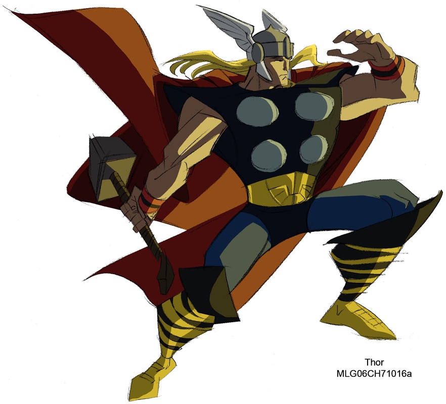
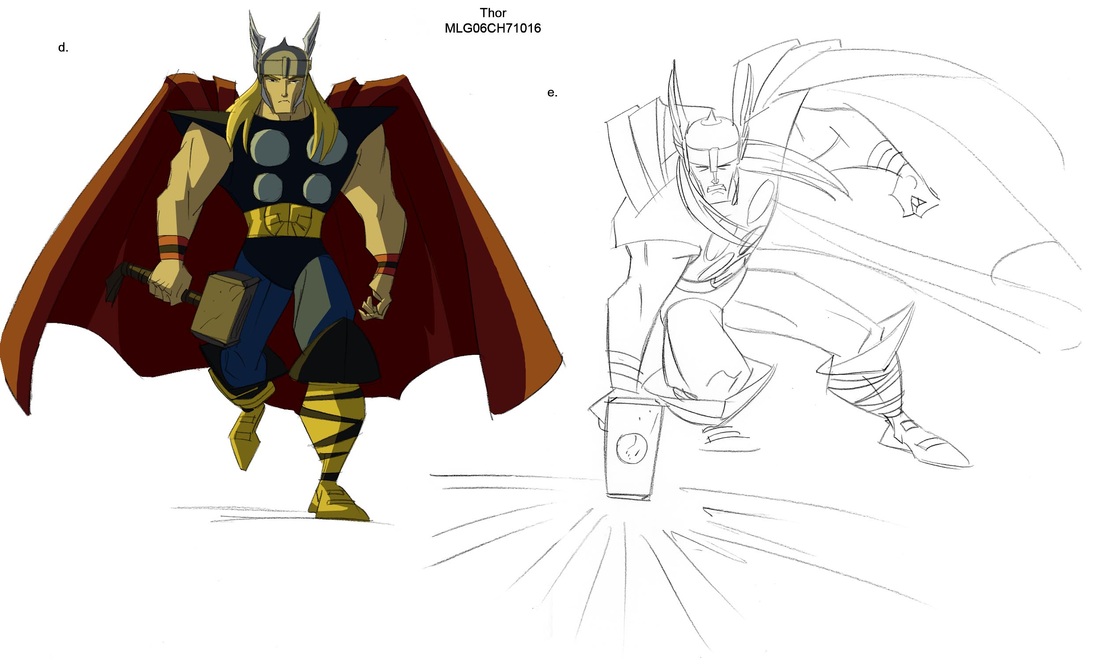
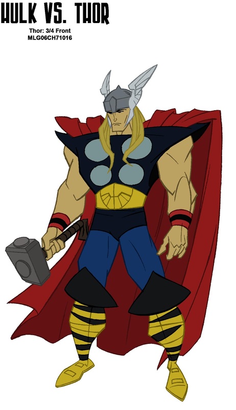
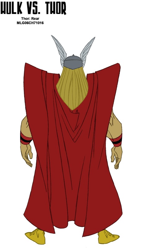
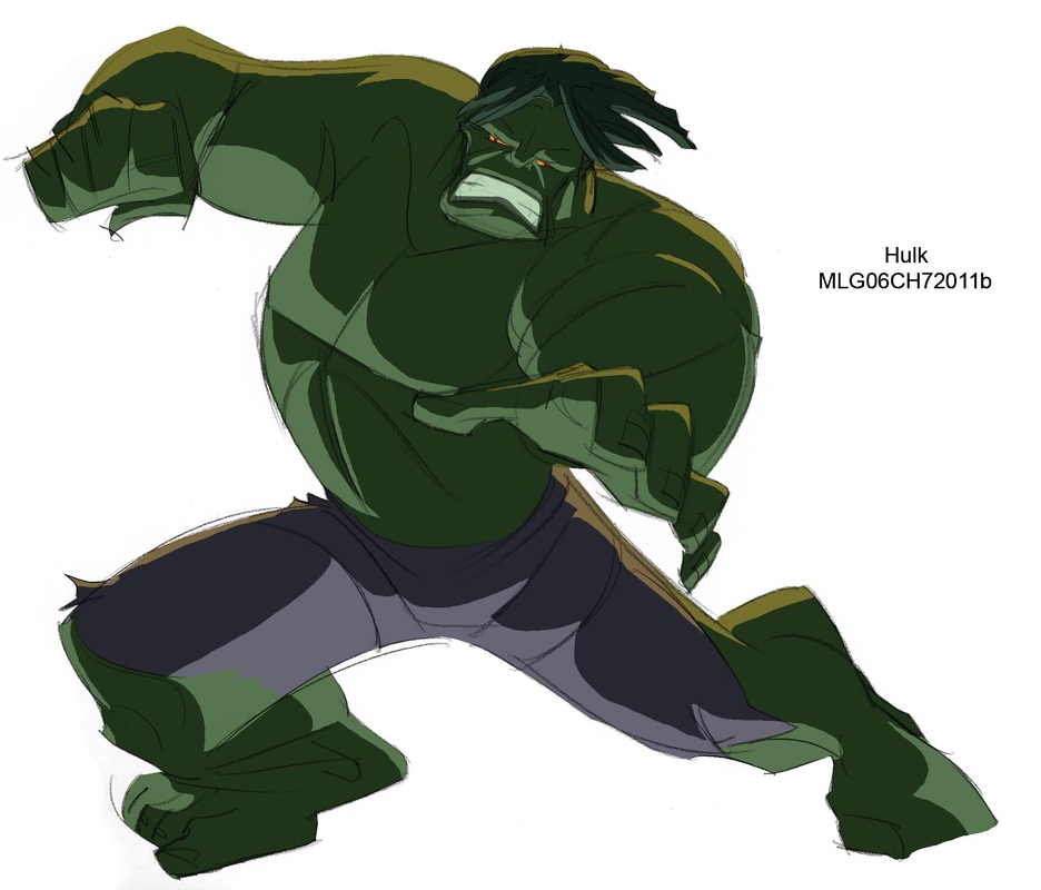
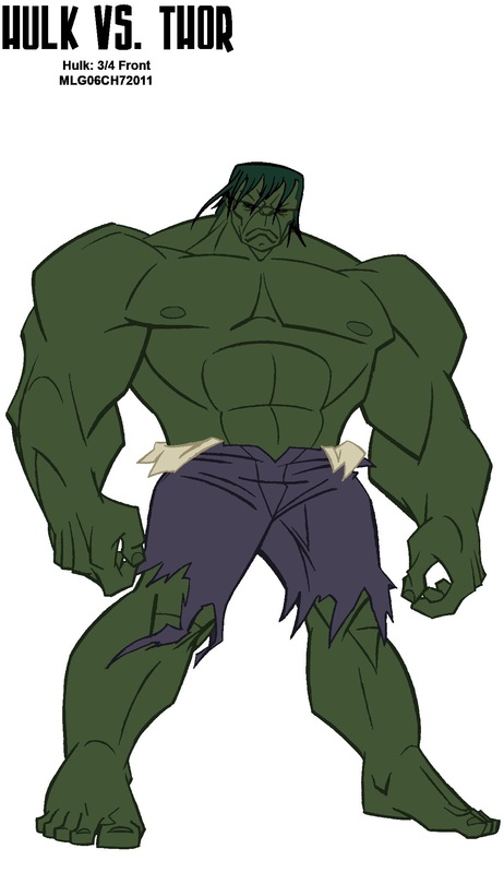
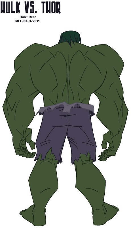
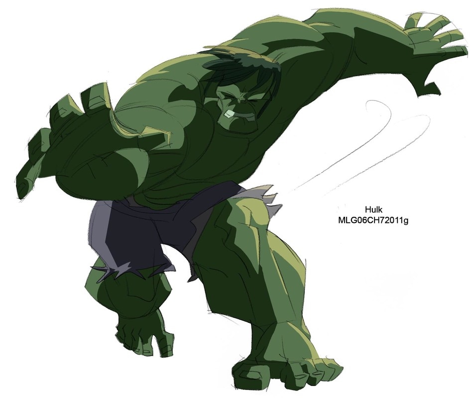
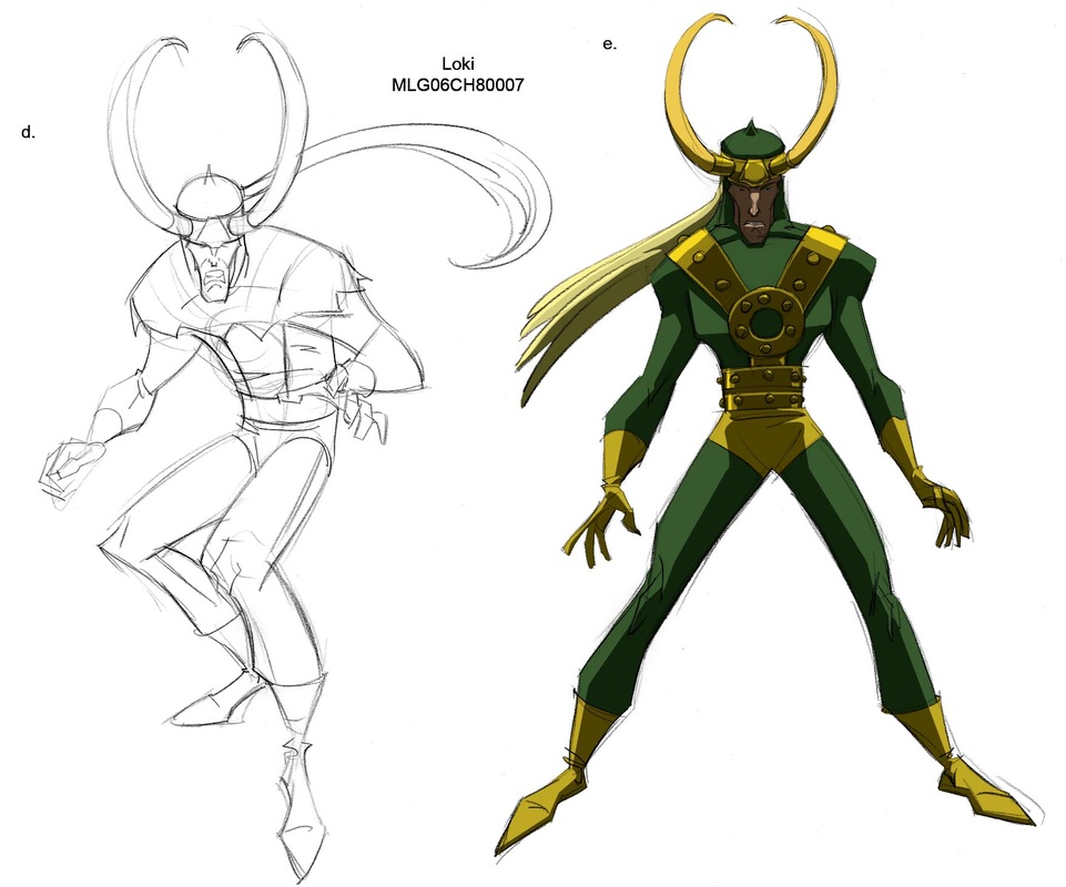
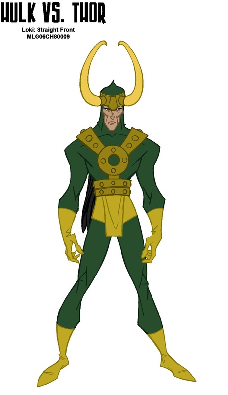
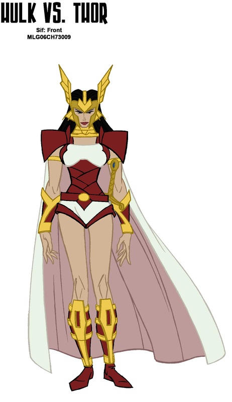
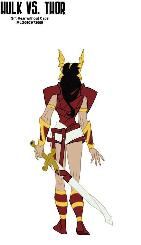
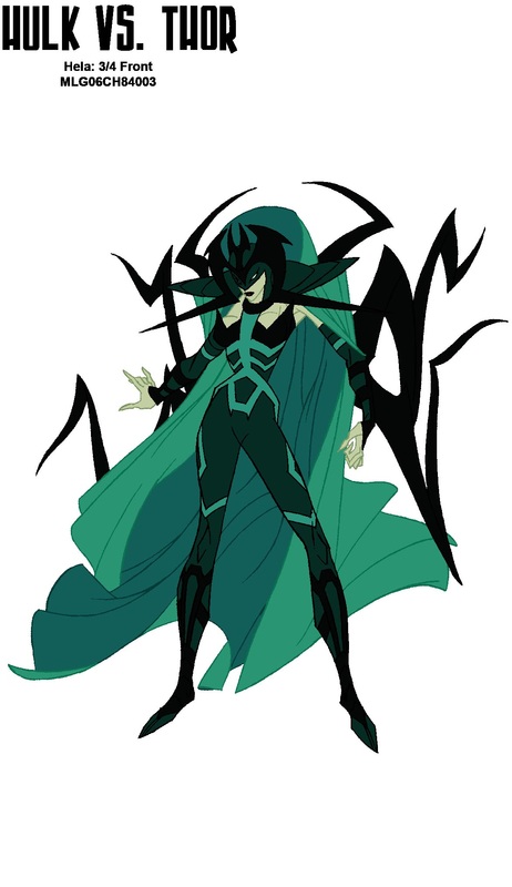
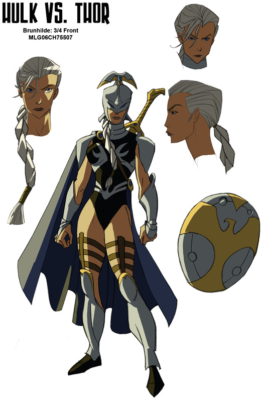
"HULK VS. THOR"
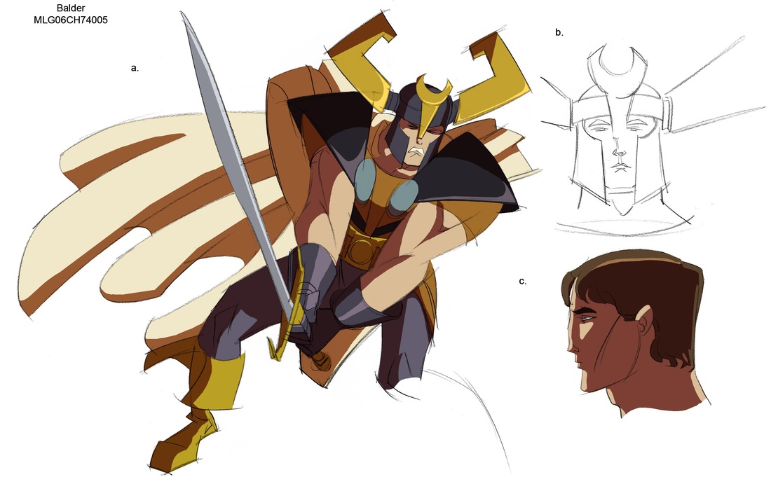
The world of Thor had to be grand. Something that could not look as if it took place on earth. Whereas Hulk/Wolverine was dark and gritty. Thor had to be colorful and dynamic, The characters godlike in their stature as if chiseled from stone. For Hulk Vs. I needed to think of the two films as bookends, not being the same but complementary to each other, one dark and one light. Heaven and Hel so to speak.
One of the obvious stylistic comparisons is that of Walt Simonson. After Jack Kirby, Walt to me, is the definitive artist of Thor. When designing these characters I also payed homage to the work of Illustrator Arnold Frieberg. Frieberg is known mostly for his religious painting as well as being the designer of Cecil B. Demille's "The Ten Commandments". The statuesque feel of the characters combined with the colorful and richly detailed backgrounds owes much to his inspirational work.
One of the obvious stylistic comparisons is that of Walt Simonson. After Jack Kirby, Walt to me, is the definitive artist of Thor. When designing these characters I also payed homage to the work of Illustrator Arnold Frieberg. Frieberg is known mostly for his religious painting as well as being the designer of Cecil B. Demille's "The Ten Commandments". The statuesque feel of the characters combined with the colorful and richly detailed backgrounds owes much to his inspirational work.
|

|
|
|
|
|
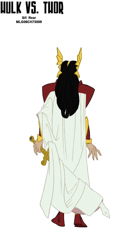
The Goddes Sif had to be athletic, she should look as if she could take out an army of mountain trolls. I gave her body a harder look with a leaner hip structure and a more muscular physique. I've always imagined that Sif could give Wonder Woman a challenge in a brawl...Maybe there's a drawing there.

|
|
|
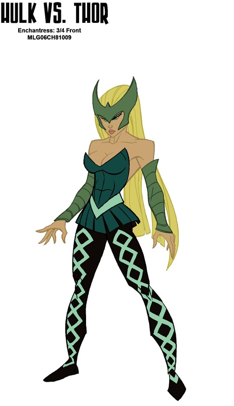
Amora the Enchantress has always been one of my female villain favorites. Not inherently evil. She is possessive, and covets that which she can never have. Her design is the opposite of Sif. Whereas Sif is more athletic and square in her design I mad Amora more rounded in her features with larger hips and ahem, portions. She is a magic user her skill set is different than a warrior and it stands to reason that she would look different than someone who trained with a sword their entire life.

|
|

|
|
|
|

|
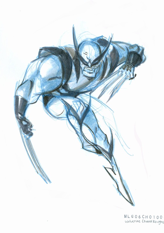
"HULK VS. WOLVERINE"
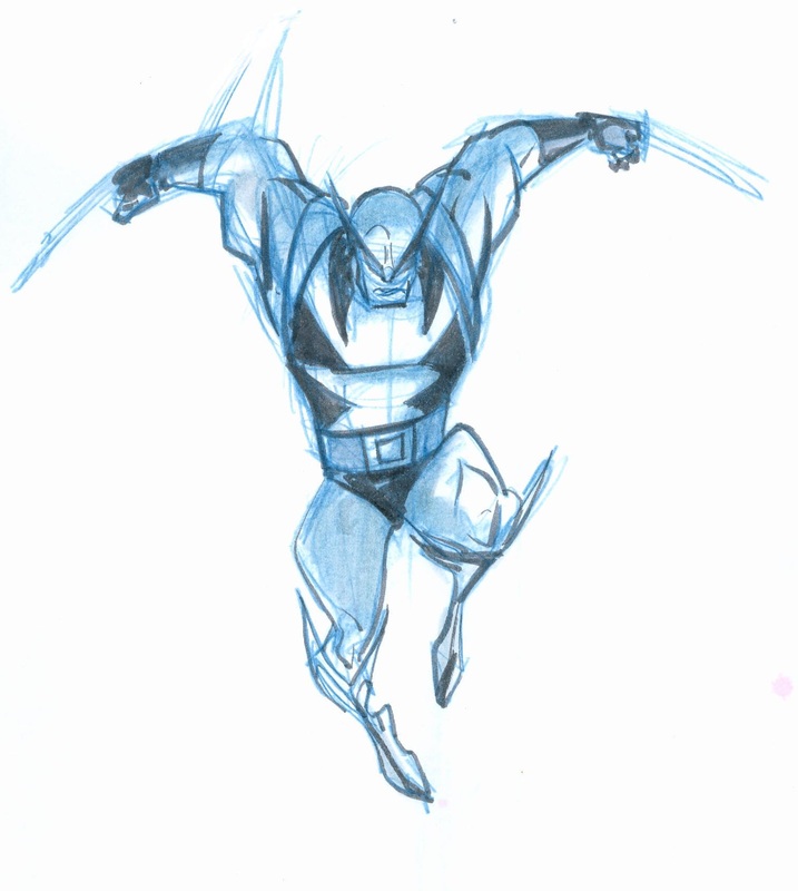
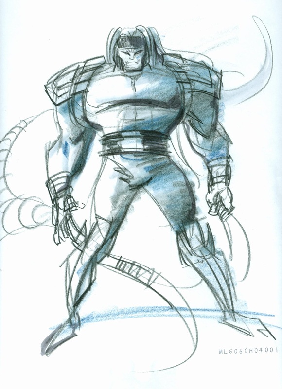
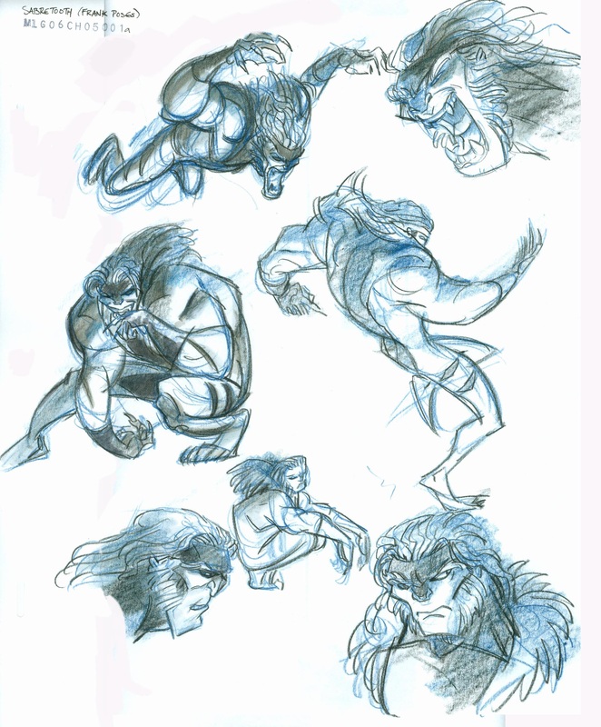
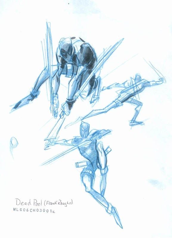
With "Hulk Vs. Wolverine" I wanted to go completely opposite from my designs on "Thor". Whereas Thor was larger than life and colorful, I felt it was important that the Wolverine segment be low down and gritty. The palette had to be more earthy in it's environment, the sense that something was foreboding about this story that played into the "horror" template that I wanted the story to present.
Ultimately I contacted Jeff Matsuda to create the final designs for the film, but before that I had to satisfy myself (and MLG) that this was the direction to go. So I created some loose drawings to help sell the concept. Another reason for this is that while the final designs were being created by Jeff Matsuda, I needed something for the in-house illustrators to work in creating the story designs which we would then send to our overseas production "Madhouse" who would be handling the animation and much of the other pre-production.
Ultimately I contacted Jeff Matsuda to create the final designs for the film, but before that I had to satisfy myself (and MLG) that this was the direction to go. So I created some loose drawings to help sell the concept. Another reason for this is that while the final designs were being created by Jeff Matsuda, I needed something for the in-house illustrators to work in creating the story designs which we would then send to our overseas production "Madhouse" who would be handling the animation and much of the other pre-production.
|
|

|
|

|

|

|

|
|
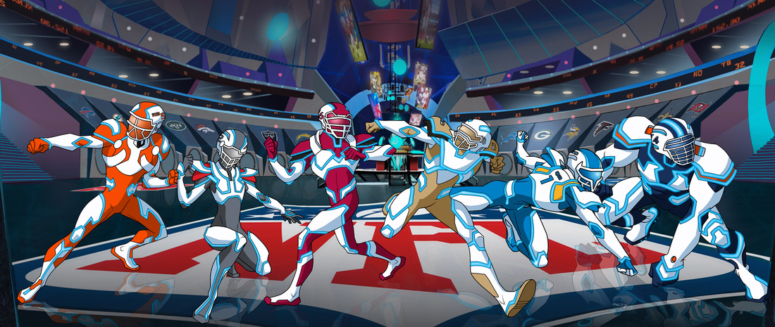
"NFL RUSH ZONE"

|
|
|

|
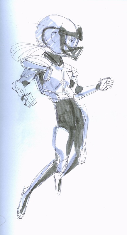
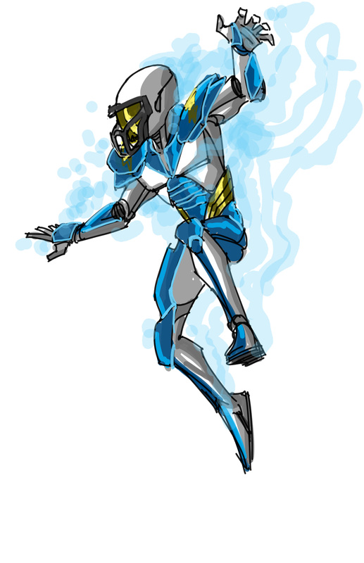
On our final season we were able to get away from the far less dynamic greens on our characters armor forms in favor of the more powerful and team centric colors shown below. These dynamic forms, I believe were drawn by Steven Gordan. They just looked so cool I had to show them off.
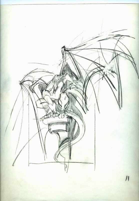
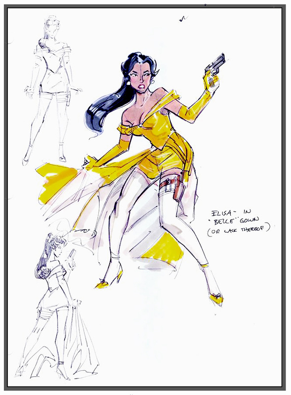
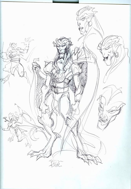
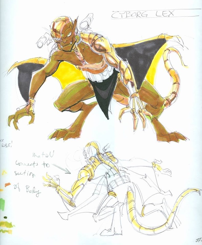
"GARGOYLES"
"GARGOYLES" Original roughs were created to get the story artists a heads up on new characters. Often times the artists when translating the scripts into story boards would not have finished designs for reference. these were created to help them and to get approvals. It would also give the character artists some breathing space until they could finish with the clean-ups.
|
|
|
|
|
|
|

|

|